Carousel Component
A carousel with smooth scrolling, navigation arrows, and dot indicators.
Image Gallery

Mountain Sunrise
Swiss Alps

Tropical Beach
Maldives

Forest Path
Pacific Northwest

Desert Dunes
Sahara

Misty Valley
Norway
0 / 0
Autoplay
Auto-advances every 4 seconds.
AutoplayAutoplayAutoplayAutoplayAutoplayBottom Navigation Style
Navigation buttons placed below the carousel content.
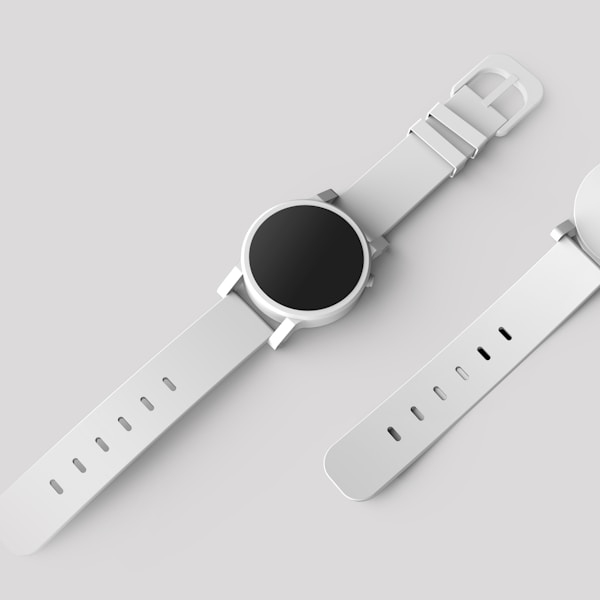
Smart Watch
$299

Headphones
$199

Smartphone
$899

Perfume
$89
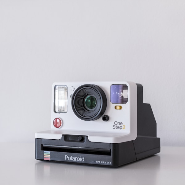
Camera
$1,299
Bar Indicator
Progress bar style indicator for slide navigation.
Thumbnail Navigation
Click thumbnails to navigate to specific slides.
Testimonials
"The capsule design system is incredibly intuitive. Our team was able to ship a beautiful product in record time."

Sarah Johnson
Product Designer at TechCo
"Clean, modern, and highly customizable. Exactly what we needed for our SaaS platform."

Michael Chen
CTO at StartupXYZ
"The attention to detail is remarkable. Every component feels polished and well-thought-out."

Emily Rodriguez
Lead Engineer at DevStudio
"This design system saved us months of work. The components are production-ready out of the box."

David Park
Frontend Lead at Scale
API Reference
Carousel
| Prop | Type | Default | Description |
|---|---|---|---|
| opts | Embla Options | - | Embla carousel options for configuration |
| plugins | Plugin[] | - | Array of Embla plugins (e.g., Autoplay) |
| setApi | (api: CarouselApi) => void | - | Callback to get carousel API instance |
| orientation | "horizontal" | "vertical" | "horizontal" | Carousel scroll direction |
| className | string | - | Additional CSS classes |
CarouselContent
| Prop | Type | Default | Description |
|---|---|---|---|
| className | string | - | Additional CSS classes for content wrapper |
CarouselItem
| Prop | Type | Default | Description |
|---|---|---|---|
| className | string | - | Additional CSS classes for carousel item |
CarouselNext / CarouselPrevious
| Prop | Type | Default | Description |
|---|---|---|---|
| className | string | - | Additional CSS classes for navigation button |
CarouselDots
| Prop | Type | Default | Description |
|---|---|---|---|
| className | string | - | Additional CSS classes for dots indicator container |